What makes good design?
Of course one could argue that it’s all subjective and hence no one really knows what makes good design, and therefore it’s all unknowable and why should we bother with this debate? On the other hand, one could argue that there are some general guidelines that make for attractive design, especially from a usability standpoint on the web, which narrow down the argument to a matter of what works best for your product.
Here are some general guidelines that I use most every time I set out to design something.
1. Layout

I’m a big fan of white space (or negative space). Negative space is a bit of a misnomer, since essentially what is happening is that it’s giving the viewer space with which to view the important content on the page or site. Cleanliness of layout (uncluttered, organized lines etc) make for an easier experience on the viewer’s eye and especially in the case of a photographer or artist website or brochure, you want the art to communicate to the viewer, have some form of emotional impact on them, and if the layout or presentation of the brochure or web page is fighting for attention, you’ll minimize the desired effect.
Alignment is another essential aspect to layout which in turn is essential to good design. Alignment of spaces and objects, shapes and colors can go wrong in minute details, but on the other hand the minutia of detail to alignment of objects can make for a beautiful layout. Why is that? What’s the difference if this text box is a millimeter to the left or right of this photo? Well, I have a theory.
The more things are in agreement with one another (alignment of objects and spaces) the more the viewer is likely to agree with what he/she is looking at. It kind of makes sense, doesn’t it? Even on a subconscious level. Did you ever look at a piece of art that you instinctively disliked, but couldn’t express exactly why you had a distaste for it? My contention is that somewhere in that piece of art, there was a misalignment of objects, spaces, shapes, sizes or colors. Put my theory to the test next time you look at something that you don’t like. Obviously there are many reasons why a person may choose not to like a piece of art and the above theory isn’t the only reason why someone might dislike something, but I’m just saying that it could be a contributing factor, and with that in mind, one can avoid it if one knows what one is looking for.
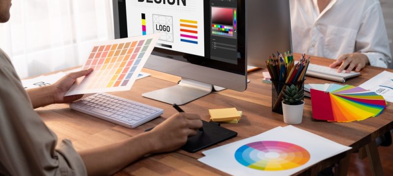
2. Color
In ancient times some scientists got together and invented “The color wheel”. Actually, I don’t know exactly how the color wheel came into existence, but the idea of a group of very scientific looking guys in lab coats in a cave somewhere just amused me. Where was I? Oh right. Color. Color is essential to good design, but more importantly, the use of combinations of colors. If you think of your page or canvas as a pool of water, it would make sense that the more color paints you add to the water, the muddier it would look. Similarly in design, it is entirely possible to use too many colors, or just as bad a mistake, the wrong combinations of colors. There are scientific reasons behind this. Light refractions and combinations of lights and optic illusions can result from the wrong combinations of colors vibrating against one another. Ever look at a block of blue over a block of red? Or visa versa? They literally vibrate, one color against the next and has a tendency to agitate the eye of the beholder. On the other hand, colors have their palettes in which they thrive and compliment one another. A good design always uses the right combination of colors which compliment one another.
")
3. Sizes
A mentor of mine once told me never to use more that three different sizes of things in a layout. Small, medium and large. Those sizes can vary as much as one can imagine, but to stick with only three sizes of things in a layout is quite an effective trick. And make all the small things the same size (agreement / alignment) and all the medium things the same size etc. It keeps the layout clean, and clearly defines what is important, and what is of lesser importance, comparitively.

4. Balance
Balance is a way of describing the elements in a layout in terms of their distribution. If things are all cluttered in the left hand column, the left side of the layout is going to feel “heavy” and unbalanced. Clever distribution of elements on a page can contribute to a well balanced layout and make the flow and presentation of information far easier to digest by the viewer.
Within the subject of balance is included the manipulation of eye lines, and mood lines and many other contributing factors.
")
5. Type
This subject (as with all of the above subjects) could fill a giant book with rules, guidelines, what-to-do’s etc. I’ll give a quick overview of what I’ve learned on the subject of type.
There is always a RIGHT font for something, and a WRONG font for something.
Ok, so I’ll try be more specific. Every layout has a purpose. To communicate something. Type, as with color, balance, flow, sizing, alignment, etc. has a huge part in this. Fonts have the particular quality of communicating a vibe, a feeling to the viewer, almost more so than a lot of other contributing factors in a layout.
Why is that? Well because the shape of a letter and thus the shape of a word has the tendency to dictate to the viewer the tone in which that word is read. In what way should a certain word or headline be read? Do you want it to be LOUD? Quiet? FUNKY? Informational!?
And it goes even further than that. Within the realms of one specific font, there is spacing between letters, spacing between words, spacing between lines… the entire subject of typesetting. Every variation has an effect on how the words are viewed and thus read and understood.
There are thousands of ways to read the same words, but depending on what font is used, you can dictate the tone of the word, and thus the tone of the layout or piece that you’re designing.
")
In Summary
There are a lot of ways to muck up a design. There are a lot of ways to make a good design. But a few ways to make a good design into a great design. One that is memorable, aesthetically pleasing, and most importantly, one that allows your message to be received clearly and the way you intended it.