Web Design Trends
Websites follow trends all the time. A while ago it was hard to find a website that didn’t have some kind of Flash animation. That went the way of the Dodo pretty fast as technology caught up and mobile companies refused to integrate flash players on devices. We also saw the seemingly meteoric rise of do-it-yourself websites based on templates, and the use of WordPress with better and better themes as the years passed. From a design standpoint, form usually followed function, as well as how easily it could be integrated.
Here are some of the trends that are we’re seeing now in the web design world.
Header layouts
Whereas the trend in the past has been to have an almost full screen slider at the top of your design, featuring images or video, the trend now is a more modest use of real estate at the top of the page.
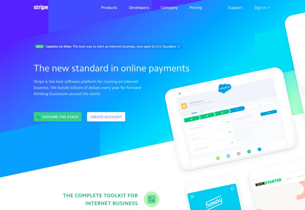
Diagonal Layouts
The block-grid format of most websites is not only something we’ve become accustomed to seeing, it’s kind of the rule of thumb. The main reason for this is that when programming or writing code for a page, it generally “thinks” in grids (pixels to the left or right or up or down from any given point).
And while this hasn’t changed essentially, there is a growing trend of using background images with diagonal lines or off-kilter layouts to attract the visitors eye line.
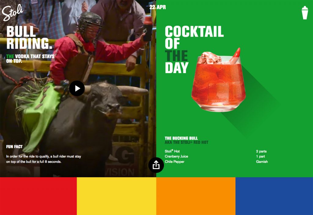
A/B Call To Actions
Most websites will have some version of a call to action. There is a slew of websites which are now using the power of choice as a very useful tool in “This or That” call to actions. In other words, “Would you like to see THIS content? Or would you like to see THAT content?”
It’s a clever way of engaging the visitor more in a sort of choose-your-own-adventure web experience.