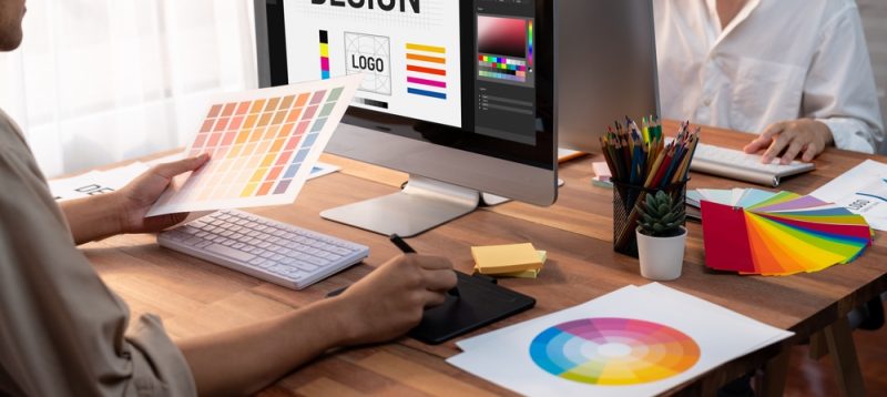
Responsive Design
I think it was Bill Gates who said some years ago, “In the future there will be two kinds of companies. One with an effective website, and one with no business at all.”
Okay, so maybe it wasn’t Bill Gates, and maybe I totally paraphrased that “quote”. But you get the idea.
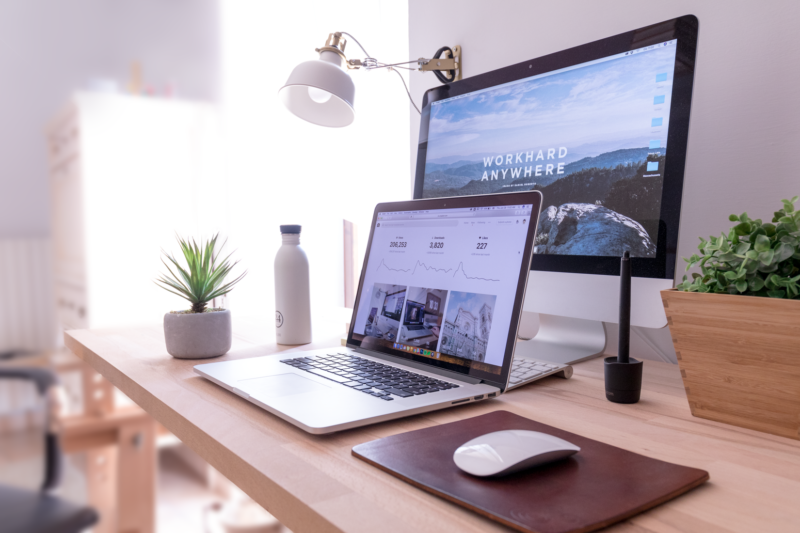
In web developer speak, a “Responsive design” is a website that is designed to change its layout, depending what device you view it on. In other words, it responds to its environment.
So, if you view a responsive website on a computer (laptop / PC) you’ll see it in its “normal” layout. But if you look at it on your iPhone or Droid device, you’ll see a different layout of the elements on the page. Same thing if you look at it on an iPad or tablet device. It automatically adjusts itself so that it’s easier to navigate in that environment.
A growing number of online activity is done on mobile nowadays. Having a responsive website is becoming more and more important as a result. It could mean the difference between a potential client looking at your site and loving what they see – or a potential client getting annoyed with your site and taking their business elsewhere.
Moral of the story – get an effective, responsive website.